Atish Shetty — Chalo Case Study
Context
Insight
Solution
Reflection
UX
Chalo Transit App
●
UX Case Study
●
Reducing Validation Friction
●
High-Pressure Moments
●
Atish Shetty
●
Chalo Transit App
●
UX Case Study
●
Reducing Validation Friction
●
High-Pressure Moments
●
Atish Shetty
●
Independent UX Exploration
CHALO
.
Ticket Friction
The most stressful moment in a bus ride isn't the commute. It's the three seconds when the conductor is waiting and your ticket is buried somewhere in the app.
Role
UX Designer (Solo)
Type
Independent Exploration
Platform
Mobile · Chalo App
Focus
Micro-interaction · UX
The trigger
ONE
MOMENT.
HUGE
FRICTION.
I was on a moving bus. One hand on the railing. The conductor was waiting. I opened Chalo and froze — Scan or Tap? Which ticket? Where's the active one?
That moment of hesitation is not a user failure. It's a design failure. And it's happening to every daily commuter, multiple times a day.
The context
THIS IS NOT A NORMAL INTERACTION
Most UX problems happen in comfortable environments — sitting at a desk, at home, with full attention. Ticket validation is different. It happens in one of the most cognitively demanding environments a commuter faces.
We're not designing for a user at their best. We're designing for someone standing, shaking, surrounded by noise, and being watched. The app has to do the thinking for them.
The constraints
Time
Only a few seconds to show the ticket. Every extra tap is a failure state.
Physical
Standing on a moving bus. Phone shaking. Sunlight glare on the screen. One hand occupied.
Cognitive
Noise, movement, distraction. Limited attention available for anything — especially navigation decisions.
Emotional
Anxiety from the conductor waiting. Embarrassment from holding up other passengers. Social pressure.
Research
WHAT I SAW & HEARD
I didn't just report my own experience. I observed other commuters and had direct conversations with regular Chalo users. The patterns were consistent.
01
Users hesitated between Scan and Tap. The two options looked similar in visual weight — no clear signal for which applied to their situation.
02
Users accidentally selected the wrong ticket. Multiple similar-looking options created decision paralysis under time pressure.
03
Navigation increased stress. Every extra screen or tap amplified anxiety — especially when the conductor was visibly impatient.
04
Conductors also experienced delays. This isn't just a user problem — it creates friction for the entire bus. A systemic failure, not an edge case.
Methods used
Self-observation
Contextual observation
Commuter conversations
Guerrilla user research
Journey analysis
THINK
Key Insight
The app asks users to think during the exact moment they have the least capacity to think.
Good UX anticipates context. The current experience treats ticket validation like any other navigation task — but it isn't. It's an urgent, time-pressured, high-stakes micro-interaction that demands zero cognitive load.
?
Opportunity
How might we surface the active ticket instantly during high-pressure transit moments — without requiring any navigation?
The Concept
TICKET COMES TO YOU
Instead of making users navigate to their ticket, surface it at the moment it's needed — through a lock-screen widget or wallet-style experience. Zero navigation. Zero decisions. The ticket is already there.
Concept Proposal
Lock-screen / Wallet Widget
A persistent, minimal ticket surface that appears contextually — showing only what the conductor needs, nothing more.
▣
Large QR Code
Scannable at arm's length, in sunlight, from a shaking hand. Size chosen for real-world conductor scanning distance.
⬡
Bus Number + Route
The one piece of information the conductor needs to verify at a glance. Nothing else competes for attention.
◎
ETA Display
Ride duration visible at a glance — reduces the need to re-open the full app mid-journey for basic information.
→
Tap to Expand
Tap the widget to open the full ticket with all details — but only if needed. The widget handles 95% of validation cases on its own.
Before → After comparison
Navigation reduced from 3+ steps to lock-screen instant access
Concept Proposal
Implementation Note
This is a conceptual exploration. The exact implementation could use platform-supported lock screen widgets, Live Activities, or wallet integrations depending on OS capabilities.
Validation
"Users appreciated it because it reduced navigation and saved time."
— Commuter feedback, validation conversations
Commuters
Faster ticket validation. Less anxiety during conductor checks. No navigation decisions under pressure.
Conductors
Fewer delays at point of validation. Improved efficiency across every bus journey.
Experience
More seamless public transport that actually works in the real physical conditions people use it in.
System
Reduces queue friction downstream — when one person validates faster, everyone moves faster.
Primary concern raised
🔒 Privacy
Users were worried about personal information being visible on the lock screen — accessible to anyone who picks up their phone.
Resolution → Show only essential ticket info (QR + bus number + ETA). No name, no payment details. Feature can be toggled on/off.
Expected impact
0taps
To reach the active ticket from the lock screen — down from 3+ navigation steps
↓stress
Conductor wait time eliminated as a source of commuter anxiety
2x users
Both commuters and conductors benefit — a systemic fix, not just UI polish
What we found when we tested
TESTING THE REDESIGNED FLOW
We tested the redesigned flow with 5 users — all regular Chalo bus commuters. The core task: find your ticket and show it to the conductor within 30 seconds.
Original App
4/5
users failed to find their ticket on the first attempt — it was buried inside a secondary section with no home screen access.
Redesigned Flow
4/5
users found their ticket successfully on the first attempt. The number that matters.
01
All 5 users found the ticket faster in the redesigned layout compared to the original.
02
The ticket verification step — tap to show vs scan — remained a point of confusion for 3 out of 5 users even after our redesign. This was our biggest unresolved problem.
03
Users preferred having the active ticket surfaced directly on the home screen. One user said "now I don't have to panic when the conductor comes."
THIS PROJECT
CHANGED
HOW I SEE
UX.
Not because of the solution — but because of the shift in how I arrived at it.
What I learned
—
Context is a constraint. A good design in a normal environment can be a bad design in a high-pressure one — the same screen behaves completely differently.
—
Identify the moment first, then the solution. I used to start with screens. Now I start with the user's worst moment and work backwards.
—
Small problems, deep insights. This isn't a big redesign — it's a single interaction. But fixing one high-friction moment can change how an entire product feels.
What I'd do next
—
Prototype and test with real commuters on real bus journeys — contextual usability testing in the actual environment where the problem occurs.
—
Research conductor workflows more deeply to reveal additional friction points I haven't mapped yet.
—
Explore GPS-based contextual triggering — the widget auto-activates when the user boards, making it even more seamless.
—
Accessibility testing — sunlight glare, screen brightness, one-handed use across a wider range of devices.
What I'd do differently
If I could restart Chalo, one thing would change immediately — I would redesign the ticket verification interaction from scratch.
01
We fixed where the ticket lives. We didn't fix how it works. The tap-to-show vs scan confusion was real, it showed up in testing, and we didn't have time to solve it properly. That's the honest truth.
02
The right solution probably isn't a button at all. It's a full-screen, conductor-facing display mode — one tap from anywhere in the app that fills the entire screen with the ticket QR, bright, unambiguous, impossible to misread. We sketched it. We didn't build it.
03
What I didn't get to: The home screen. We audited it, we identified problems, we ran out of time. A redesigned home screen that surfaces the active ticket, next bus timing, and recent routes — without any navigation — would have completed the experience. Instead we patched one part of a broken flow.
"Good UX is about reducing friction, not adding features. The best solution here isn't a new screen — it's making a screen disappear."
The lesson: Redesigning one screen in isolation rarely solves the real problem. The ticket confusion existed because the whole journey from purchase to verification was never designed as one connected flow.
LESS
FRICTION.
BETTER
TRANSIT.
Public transport UX is underdesigned for real-world conditions. Chalo is a great app — this exploration shows one moment where it can go even further. This is the kind of UX thinking I bring to every product I work on.
Back to Portfolio →
Designer
Atish Shetty
Type
Independent UX Exploration
Platform
Chalo Mobile App
Focus
Contextual UX · Micro-interaction
Research
Self-obs · Contextual · Guerrilla
Status
Concept Proposal
Atish Shetty — Chalo Case Study
Context
Insight
Solution
Reflection
UX
Independent UX Exploration
CHALO
.
Ticket Friction
The most stressful moment in a bus ride isn't the commute. It's the three seconds when the conductor is waiting and your ticket is buried somewhere in the app.
Role
UX Designer (Solo)
Type
Independent Exploration
Platform
Mobile · Chalo App
Focus
Micro-interaction · UX
The trigger
ONE
MOMENT.
HUGE
FRICTION.
I was on a moving bus. One hand on the railing. The conductor was waiting. I opened Chalo and froze — Scan or Tap? Which ticket? Where's the active one?
That moment of hesitation is not a user failure. It's a design failure. And it's happening to every daily commuter, multiple times a day.
The context
THIS IS NOT A NORMAL INTERACTION
Most UX problems happen in comfortable environments — sitting at a desk, at home, with full attention. Ticket validation is different. It happens in one of the most cognitively demanding environments a commuter faces.
We're not designing for a user at their best. We're designing for someone standing, shaking, surrounded by noise, and being watched. The app has to do the thinking for them.
The constraints
Time
Only a few seconds to show the ticket. Every extra tap is a failure state.
Physical
Standing on a moving bus. Phone shaking. Sunlight glare on the screen. One hand occupied.
Cognitive
Noise, movement, distraction. Limited attention available for anything — especially navigation decisions.
Emotional
Anxiety from the conductor waiting. Embarrassment from holding up other passengers. Social pressure.
Research
WHAT I SAW & HEARD
I didn't just report my own experience. I observed other commuters and had direct conversations with regular Chalo users. The patterns were consistent.
01
Users hesitated between Scan and Tap. The two options looked similar in visual weight — no clear signal for which applied to their situation.
02
Users accidentally selected the wrong ticket. Multiple similar-looking options created decision paralysis under time pressure.
03
Navigation increased stress. Every extra screen or tap amplified anxiety — especially when the conductor was visibly impatient.
04
Conductors also experienced delays. This isn't just a user problem — it creates friction for the entire bus. A systemic failure, not an edge case.
Methods used
Self-observation
Contextual observation
Commuter conversations
Guerrilla user research
Journey analysis
THINK
Key Insight
The app asks users to think during the exact moment they have the least capacity to think.
Good UX anticipates context. The current experience treats ticket validation like any other navigation task — but it isn't. It's an urgent, time-pressured, high-stakes micro-interaction that demands zero cognitive load.
?
Opportunity
How might we surface the active ticket instantly during high-pressure transit moments — without requiring any navigation?
The Concept
TICKET COMES TO YOU
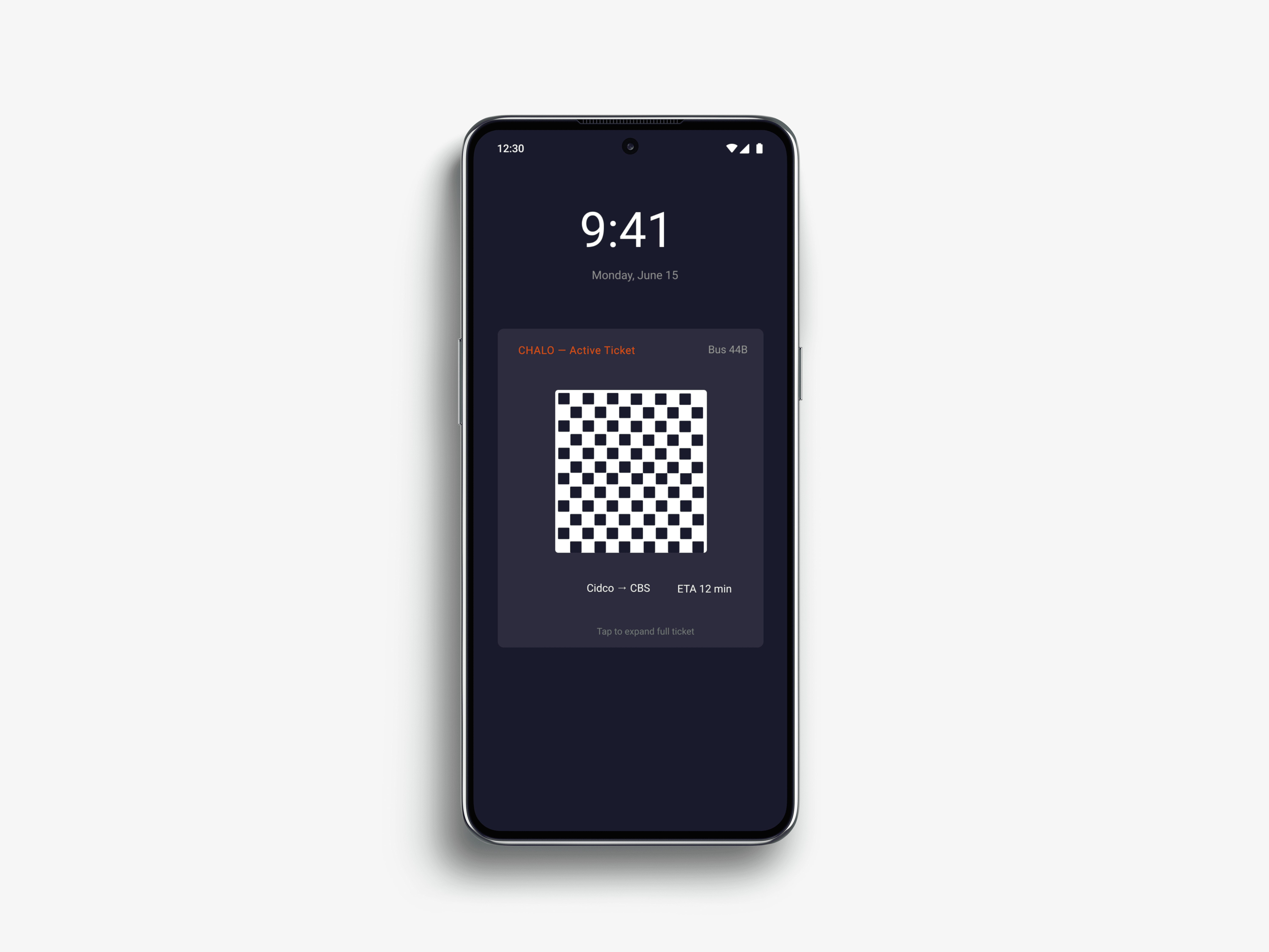
Instead of making users navigate to their ticket, surface it at the moment it's needed — through a lock-screen widget or wallet-style experience. Zero navigation. Zero decisions. The ticket is already there.
Concept Proposal
Lock-screen / Wallet Widget
A persistent, minimal ticket surface that appears contextually — showing only what the conductor needs, nothing more.
▣
Large QR Code
Scannable at arm's length, in sunlight, from a shaking hand. Size chosen for real-world conductor scanning distance.
⬡
Bus Number + Route
The one piece of information the conductor needs to verify at a glance. Nothing else competes for attention.
◎
ETA Display
Ride duration visible at a glance — reduces the need to re-open the full app mid-journey for basic information.
→
Tap to Expand
Tap the widget to open the full ticket with all details — but only if needed. The widget handles 95% of validation cases on its own.
Before → After comparison
Navigation reduced from 3+ steps to lock-screen instant access
Concept Proposal
Implementation Note
This is a conceptual exploration. The exact implementation could use platform-supported lock screen widgets, Live Activities, or wallet integrations depending on OS capabilities.
Validation
"Users appreciated it because it reduced navigation and saved time."
— Commuter feedback, validation conversations
Commuters
Faster ticket validation. Less anxiety during conductor checks. No navigation decisions under pressure.
Conductors
Fewer delays at point of validation. Improved efficiency across every bus journey.
Experience
More seamless public transport that actually works in the real physical conditions people use it in.
System
Reduces queue friction downstream — when one person validates faster, everyone moves faster.
Primary concern raised
🔒 Privacy
Users were worried about personal information being visible on the lock screen — accessible to anyone who picks up their phone.
Resolution → Show only essential ticket info (QR + bus number + ETA). No name, no payment details. Feature can be toggled on/off.
Expected impact
0taps
To reach the active ticket from the lock screen — down from 3+ navigation steps
↓stress
Conductor wait time eliminated as a source of commuter anxiety
2x users
Both commuters and conductors benefit — a systemic fix, not just UI polish
What we found when we tested
TESTING THE REDESIGNED FLOW
We tested the redesigned flow with 5 users — all regular Chalo bus commuters. The core task: find your ticket and show it to the conductor within 30 seconds.
Original App
4/5
users failed to find their ticket on the first attempt — it was buried inside a secondary section with no home screen access.
Redesigned Flow
4/5
users found their ticket successfully on the first attempt. The number that matters.
01
All 5 users found the ticket faster in the redesigned layout compared to the original.
02
The ticket verification step — tap to show vs scan — remained a point of confusion for 3 out of 5 users even after our redesign. This was our biggest unresolved problem.
03
Users preferred having the active ticket surfaced directly on the home screen. One user said "now I don't have to panic when the conductor comes."
THIS PROJECT
CHANGED
HOW I SEE
UX.
Not because of the solution — but because of the shift in how I arrived at it.
What I learned
—
Context is a constraint. A good design in a normal environment can be a bad design in a high-pressure one — the same screen behaves completely differently.
—
Identify the moment first, then the solution. I used to start with screens. Now I start with the user's worst moment and work backwards.
—
Small problems, deep insights. This isn't a big redesign — it's a single interaction. But fixing one high-friction moment can change how an entire product feels.
What I'd do next
—
Prototype and test with real commuters on real bus journeys — contextual usability testing in the actual environment where the problem occurs.
—
Research conductor workflows more deeply to reveal additional friction points I haven't mapped yet.
—
Explore GPS-based contextual triggering — the widget auto-activates when the user boards, making it even more seamless.
—
Accessibility testing — sunlight glare, screen brightness, one-handed use across a wider range of devices.
What I'd do differently
If I could restart Chalo, one thing would change immediately — I would redesign the ticket verification interaction from scratch.
01
We fixed where the ticket lives. We didn't fix how it works. The tap-to-show vs scan confusion was real, it showed up in testing, and we didn't have time to solve it properly. That's the honest truth.
02
The right solution probably isn't a button at all. It's a full-screen, conductor-facing display mode — one tap from anywhere in the app that fills the entire screen with the ticket QR, bright, unambiguous, impossible to misread. We sketched it. We didn't build it.
03
What I didn't get to: The home screen. We audited it, we identified problems, we ran out of time. A redesigned home screen that surfaces the active ticket, next bus timing, and recent routes — without any navigation — would have completed the experience. Instead we patched one part of a broken flow.
"Good UX is about reducing friction, not adding features. The best solution here isn't a new screen — it's making a screen disappear."
The lesson: Redesigning one screen in isolation rarely solves the real problem. The ticket confusion existed because the whole journey from purchase to verification was never designed as one connected flow.
LESS
FRICTION.
BETTER
TRANSIT.
Public transport UX is underdesigned for real-world conditions. Chalo is a great app — this exploration shows one moment where it can go even further. This is the kind of UX thinking I bring to every product I work on.
Back to Portfolio →
Designer
Atish Shetty
Type
Independent UX Exploration
Platform
Chalo Mobile App
Focus
Contextual UX · Micro-interaction
Research
Self-obs · Contextual · Guerrilla
Status
Concept Proposal
Chalo Transit App
UX Case Study
Reducing Validation Friction
High-Pressure Moments
Atish Shetty
— Independent UX Exploration
CHALO.
Ticket Friction
The most stressful moment in a bus ride isn't the commute. It's the three seconds when the conductor is waiting and your ticket is buried somewhere in the app.
Role
UX Designer (Solo)
Type
Independent Exploration
Platform
Mobile · Chalo App
Focus
Micro-interaction · UX
The trigger
One moment. Huge friction.
I was on a moving bus. One hand on the railing. The conductor was waiting. I opened Chalo and froze — Scan or Tap? Which ticket? Where's the active one?
That moment of hesitation is not a user failure. It's a design failure. And it's happening to every daily commuter, multiple times a day.
The context
This is not a normal interaction
Most UX problems happen in comfortable environments — sitting at a desk, at home, with full attention. Ticket validation is different. It happens in one of the most cognitively demanding environments a commuter faces.
We're not designing for a user at their best. We're designing for someone standing, shaking, surrounded by noise, and being watched. The app has to do the thinking for them.
The constraints
Time
Only a few seconds to show the ticket. Every extra tap is a failure state.
Physical
Standing on a moving bus. Phone shaking. Sunlight glare on the screen. One hand occupied.
Cognitive
Noise, movement, distraction. Limited attention available for anything — especially navigation decisions.
Emotional
Anxiety from the conductor waiting. Embarrassment from holding up other passengers. Social pressure.
Research
What I saw & heard
I didn't just report my own experience. I observed other commuters and had direct conversations with regular Chalo users. The patterns were consistent.
01
Users hesitated between Scan and Tap. The two options looked similar in visual weight — no clear signal for which applied to their situation.
02
Users accidentally selected the wrong ticket. Multiple similar-looking options created decision paralysis under time pressure.
03
Navigation increased stress. Every extra screen or tap amplified anxiety — especially when the conductor was visibly impatient.
04
Conductors also experienced delays. This isn't just a user problem — it creates friction for the entire bus. A systemic failure, not an edge case.
Methods used
Self-observation
Contextual observation
Commuter conversations
Guerrilla user research
Journey analysis
Key Insight
The app asks users to think during the exact moment they have the least capacity to think.
Good UX anticipates context. The current experience treats ticket validation like any other navigation task — but it isn't. It's an urgent, time-pressured, high-stakes micro-interaction that demands zero cognitive load.
Opportunity
How might we surface the active ticket instantly during high-pressure transit moments — without requiring any navigation?
THINK
The concept
Ticket comes to you
Instead of making users navigate to their ticket, surface it at the moment it's needed — through a lock-screen widget or wallet-style experience. Zero navigation. Zero decisions. The ticket is already there.
Concept Proposal
Lock-screen / Wallet Widget
A persistent, minimal ticket surface that appears contextually — showing only what the conductor needs, nothing more.
Large QR Code
Scannable at arm's length, in sunlight, from a shaking hand. Size chosen for real-world conductor scanning distance.
Bus Number + Route
The one piece of information the conductor needs to verify at a glance. Nothing else competes for attention.
ETA Display
Ride duration visible at a glance — reduces the need to re-open the full app mid-journey for basic information.
Tap to Expand
Tap the widget to open the full ticket with all details — but only if needed. The widget handles 95% of validation cases on its own.

Implementation Note
This is a conceptual exploration. The exact implementation could use
platform-supported lock screen widgets, Live Activities, or wallet integrations
depending on OS capabilities.
Validation
"Users appreciated it because it reduced navigation and saved time."
— Commuter feedback, validation conversations
Commuters
Faster ticket validation. Less anxiety during conductor checks. No navigation decisions under pressure.
Conductors
Fewer delays at point of validation. Improved efficiency across every bus journey.
Experience
More seamless public transport that actually works in the real physical conditions people use it in.
System
Reduces queue friction downstream — when one person validates faster, everyone moves faster.
Primary concern raised
🔒 Privacy
Users were worried about personal information being visible on the lock screen — accessible to anyone who picks up their phone.
Resolution → Show only essential ticket info (QR + bus number + ETA). No name, no payment details. Feature can be toggled on/off.
Expected impact
0 taps
To reach the active ticket from the lock screen — down from 3+ navigation steps
↓ stress
Conductor wait time eliminated as a source of commuter anxiety
2X users
Both commuters and conductors benefit — a systemic fix, not just UI polish
What we found when we tested
Testing the redesigned flow
We tested the redesigned flow with 5 users — all regular Chalo bus commuters. The core task: find your ticket and show it to the conductor within 30 seconds.
Original App
4/5
users
failed
to find their ticket on the first attempt — it was buried inside a secondary section with no home screen access.
Redesigned Flow
4/5
users
found
their ticket successfully on the first attempt. The number that matters.
01
All 5 users found the ticket faster in the redesigned layout compared to the original.
02
The ticket verification step — tap to show vs scan — remained a point of confusion for 3 out of 5 users even after our redesign. This was our biggest unresolved problem.
03
Users preferred having the active ticket surfaced directly on the home screen. One user said "now I don't have to panic when the conductor comes."
This project changed how I see UX.
Not because of the solution — but because of the shift in how I arrived at it.
What I learned
—
Context is a constraint. A good design in a normal environment can be a bad design in a high-pressure one — the same screen behaves completely differently.
—
Identify the moment first, then the solution. I used to start with screens. Now I start with the user's worst moment and work backwards.
—
Small problems, deep insights. This isn't a big redesign — it's a single interaction. But fixing one high-friction moment can change how an entire product feels.
What I'd do next
—
Prototype and test with real commuters on real bus journeys — contextual usability testing in the actual environment where the problem occurs.
—
Research conductor workflows more deeply to reveal additional friction points I haven't mapped yet.
—
Explore GPS-based contextual triggering — the widget auto-activates when the user boards, making it even more seamless.
—
Accessibility testing — sunlight glare, screen brightness, one-handed use across a wider range of devices.
What I'd do differently
If I could restart Chalo, one thing would change immediately — I would redesign the ticket verification interaction from scratch.
01
We fixed where the ticket lives. We didn't fix how it works. The tap-to-show vs scan confusion was real, it showed up in testing, and we didn't have time to solve it properly. That's the honest truth.
02
The right solution probably isn't a button at all. It's a full-screen, conductor-facing display mode — one tap from anywhere in the app that fills the entire screen with the ticket QR, bright, unambiguous, impossible to misread. We sketched it. We didn't build it.
03
What I didn't get to: The home screen. We audited it, we identified problems, we ran out of time. A redesigned home screen that surfaces the active ticket, next bus timing, and recent routes — without any navigation — would have completed the experience. Instead we patched one part of a broken flow.
"Good UX is about reducing friction, not adding features. The best solution here isn't a new screen — it's making a screen disappear."
The lesson: Redesigning one screen in isolation rarely solves the real problem. The ticket confusion existed because the whole journey from purchase to verification was never designed as one connected flow.
Less friction. Better transit.
Public transport UX is underdesigned for real-world conditions. Chalo is a great app — this exploration shows one moment where it can go even further. This is the kind of UX thinking I bring to every product I work on.
Back to Portfolio →
Designer
Atish Shetty
Type
Independent UX Exploration
Platform
Chalo Mobile App
Focus
Contextual UX · Micro-interaction
Research
Self-obs · Contextual · Guerrilla
Status
Concept Proposal